Table of Contents
Using the Marketing Design Editor
The marketing design editor lets you personalize your print marketing designs so they are tailored towards your contacts unique needs.
Design Editor Basics
No matter what type of design you are editing, the editor has four primary areas:
- Main Tool Bar: The toolbar is available with every design and will provide you with the tools necessary to start customizing your design.
- Design Elements: An element refers to a text box, image, map, or shape that is part of your marketing design.
- Page Navigation: Allows you to navigate between pages in a multi-page document, such as a postcard or guide.
- Pop-up toolbar: When you have selected an object in your design, an advanced toolbar will pop up working with the Main Toolbar
The Main Toolbar will always display these buttons. Let’s go over what each button does.
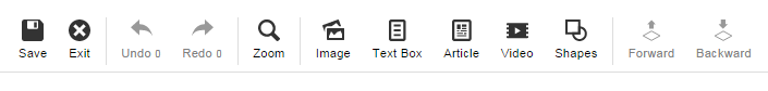
Save

Select Save at any time while editing your marketing design. It is a good idea to save often, to ensure that you don’t lose your changes. If you are saving a design for the first time, click save and name your design.
Exit
If you want to exit your design click Exit. If you have not saved, the system will prompt you to do so.
Undo or Redo

The Undo button allows you to quickly undo your recent changes. The Redo button allows you to redo something you just undid. Each button shows the number of steps that you can undo/redo. When you first start editing your design they will both show “0”.
As you make changes to your design, the number under the Undo button will go up. This is the number of changes you have made to your design, including images added or text you’ve entered.
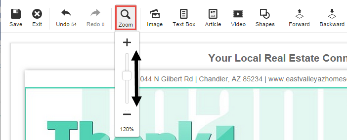
Zoom
Select the Zoom button to zoom in or out on your marketing design.
Image, Text Box, Article, Video & Shapes

These buttons will allow you to add elements to your design:
- Image will pull up stock photos, your photos, and an option to upload new photos.
- Text box will create a blank space to type in.
- Article will give you a selection of pre scripted content to add.
- Video give you the option to add a link to a video.
- Shapes will give you a variety of shapes to add to your design.
- Map will place a map on your design that can be edited to your liking.
Forward, Backward

When you add a new element to your marketing design, it will be in the foreground of your piece. The Forward and Backward buttons allow you to move the elements of your marketing design in front of or behind other elements. This enables you to choose which part of your design you’d like to work on—as well as choose which elements will be in the background or the foreground of the design.
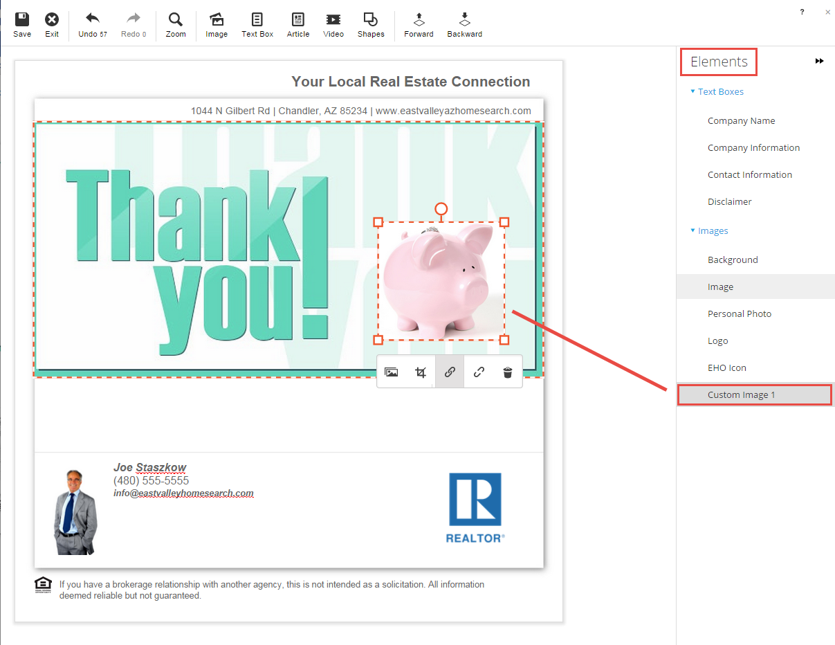
Working with Design Elements
What is an element? An element refers to a text box, image, or shape that is part of your marketing design. There are several elements that can be used to personalize your design.
Design Elements
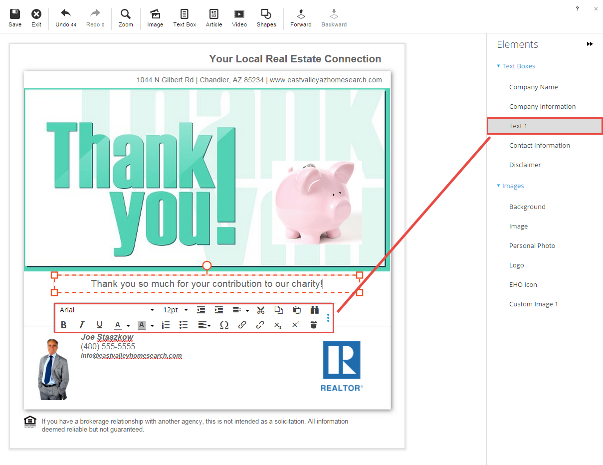
Any elements that are editable in your design are listed on the right-hand side of the editor view. If you hover your mouse over any of the elements in the design or on the left-hand list, a red box will form around the element. This is also where you can access/edit the back of a postcard.
As you add elements to your design, you’ll see the element populate in the corresponding category.
Images
Adding images to your design is the easiest way to personalize a design.
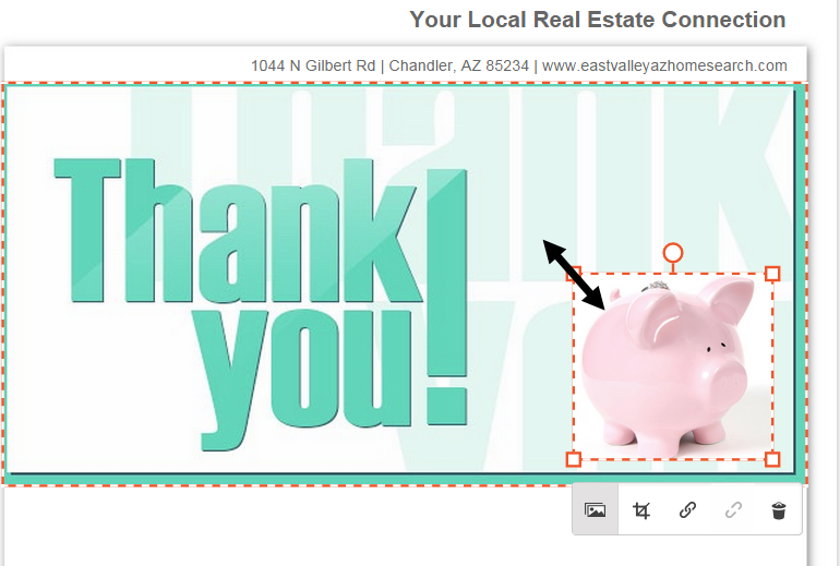
Add Images to a Design
To add an image, click the Image button in the Main Toolbar.

A placeholder image will be placed in your design, and the right pane of the editor becomes your library of photos and upload options. You will also notice a Pop-up Editor will appear. The Replace Image button will open up the Image Library, so that you can select a different image.
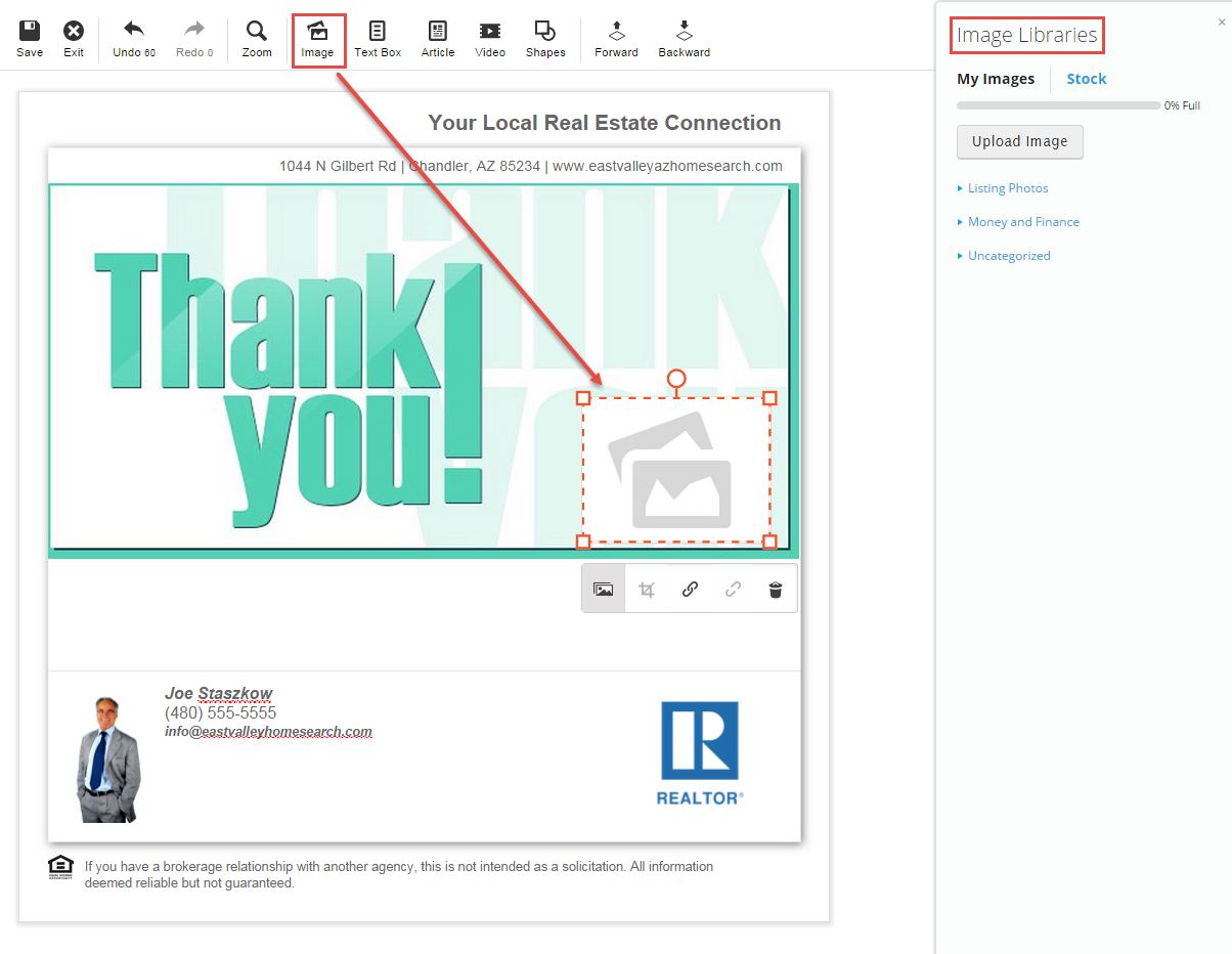
You have three options for adding an image:
- Select an image from your My Images. This is where you can find any images that you have uploaded to your Image Manager. When you click on the image you want to use, the placeholder image will be replaced with the selected image.
- Select from available Stock Images. Click the Stock Images tab in the Image Libraries to choose from a selection of pre-loaded images. Click on the image you want to use and the placeholder image will be replaced with the selected image.
- Click the Upload Image button to upload a new image from your computer. Uploaded images will be stored in your Image Manager for future use.
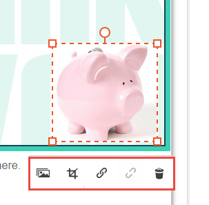
Edit an Image
When you click on your image, you will see the Pop-up Editor appear with your design options:
- Resize an Image
- Move an Image
- Rotate an Image
- Crop an Image
Resize an Image
To resize an image place your mouse over one of the corners until your cursor turns into a double-headed arrow. Then, click and hold down, while dragging the corner until the image is the size that you want.
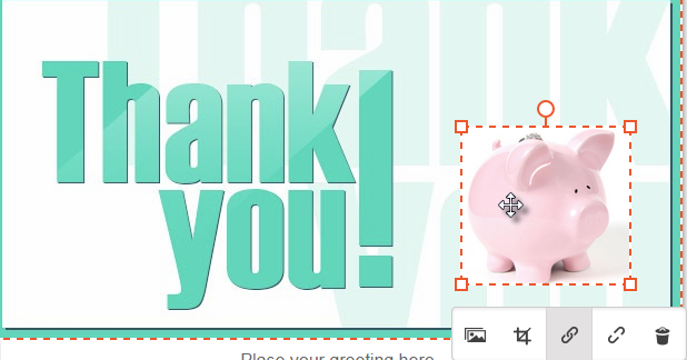
Move an Image
To move an image place your mouse over the image until it becomes a four-headed arrow. Click and hold down, while dragging your image until you have it placed where you want. Then, let go of your mouse.
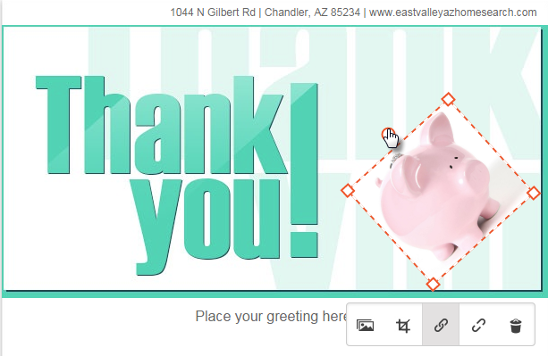
Rotate an Image
To rotate an image, place your mouse over the red circle at the top of the image. Move your mouse while holding the click button to tilt the image to your desired angle.
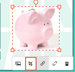
Crop an Image
To crop an image, click on the image and select the crop button. A new window will open, called the Image Crop Tool. When you are finished cropping your image, click Done. Your image will be updated with the crop applied.
Text Boxes
Adding text boxes to your design lets you include relevant information for your contacts. To add a text box, click Text Box from the menu.
A text box with placeholder text will be placed in your design and you’ll have access to the Text Editing Tools.
You can then use the Text Editing Tools Pop-up Toolbar to customize your text. Click on the three blue dots to expand more options.
The Text Editing Tools function just like in a word processing program, such as Microsoft Word. You’ll be able to change your font, text size, or even change the text color.
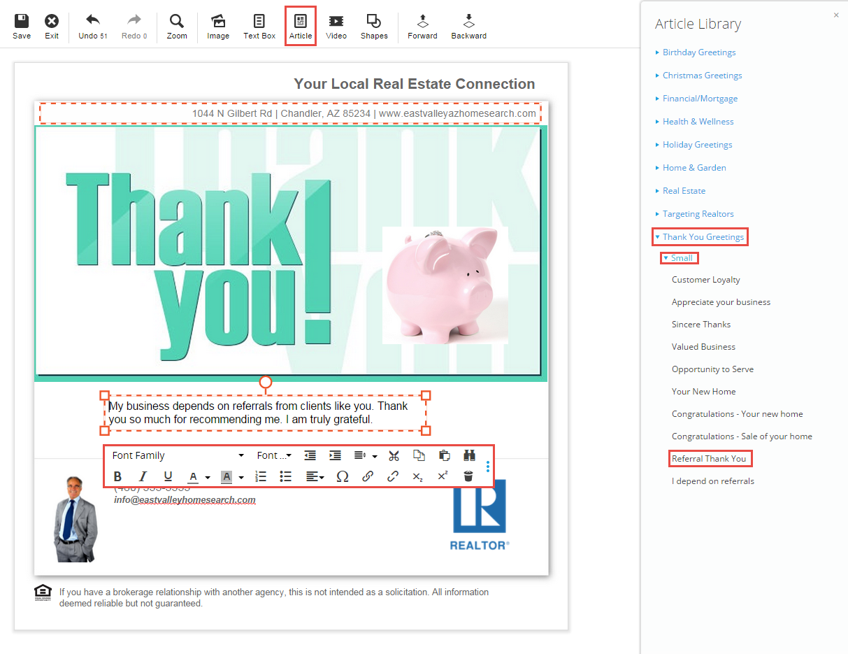
When you click the Article button, a list of available pre-loaded articles will become available. The articles are sorted into categories. Click on a category to expand it and see the articles for that category. You can then edit the text in the category to your liking.
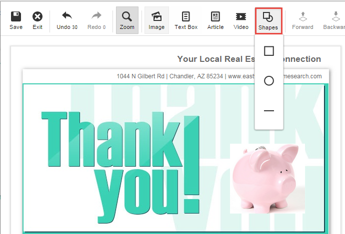
Shapes
Adding shapes is a good way to add a little fun and flare to your design. You’ll be able to change the color and size of your or even layer it so it provides a background for your text. To add a shape, click the Shapes button. You’ll be able to add a rectangle, a circle, or a straight line.
A shape placeholder will be placed in your design and you’ll see the Shapes Toolbar will now be available.
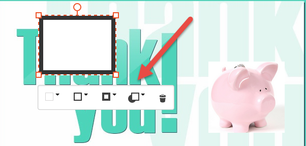
With the shapes toolbar, you can change the background and border colors, thickness and opacity. To remove the shape, click the trash can button.
Map
Adding a map to your design is a great way to provide your customers with a visual, showing them the location of a property or event. Clicking on the Map button on the Main Tool Bar will place a map on your design.

From here you can edit the address of the map pin.
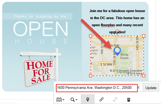
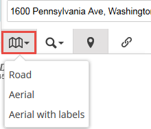
You can also change the type of map to road, aerial, or aerial with labels.